Have you ever looked at your website and thought, “Something just feels off?” Maybe it’s not as fresh, fast, or user-friendly as you would like. For many customers, your website is their first impression of your business, and if it looks outdated or is difficult to navigate, it could be turning them away before they even get to know you.
Websites need regular updates to stay effective, just like any part of your business. What looked great and worked well a few years ago might feel clunky now. Technology changes, people’s expectations grow, and design trends move forward. If your website is showing any of these ten signs, it could be time for a redesign to keep your business looking sharp and competitive. Let’s get into it!
🔍 Did you know nearly 81% of website redesign projects are due to low conversion rates?
What is Website Redesign?
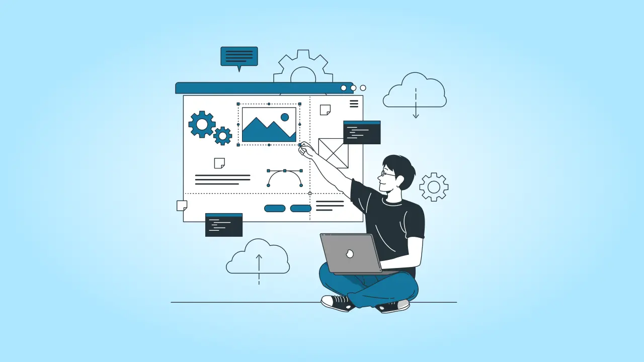
A website redesign means giving your site a major upgrade—essentially a fresh start rather than a few small fixes. It’s about rethinking the look, feel, and functionality of your site to improve the overall experience for visitors.
Unlike minor updates, which might involve swapping out a few images or updating some text, a redesign digs deeper. It’s a complete overhaul, often involving big changes to your website’s layout, colors, fonts, navigation, and even how it works behind the scenes.
Typical Elements of a Redesign
Redesigning a website covers everything from visuals to technical updates. Here are some key changes that typically happen in a redesign:
- Layout and Navigation: Making the structure more intuitive so users can easily find what they’re looking for.
- Color Schemes and Typography: Updating design elements to create a fresh, cohesive look that matches your brand.
- User Interface (UI) Elements: Adding or changing buttons, forms, and other interactive parts to make the site easier to use.
- Content Management System (CMS): Sometimes switching to a new CMS that’s easier to manage or offers better features.
- New Features: Adding things like e-commerce capabilities, improved security, or integrations with social media or other platforms.
Reasons for Redesigning a Website
Businesses typically decide on a redesign for several common reasons:
- Outdated Design: If the site looks old-fashioned, visitors might question the professionalism or relevance of your business.
- Poor Mobile Experience: Many people browse on mobile, so if your site doesn’t work well on phones or tablets, you could be losing traffic.
- Low Conversion Rates: If users are visiting but not taking action (like making a purchase or signing up), a redesign can help guide them toward those steps.
- Rebranding: If your business has a new logo, color palette, or overall direction, your site should reflect that.
- Enhanced Functionality: You might want to add new tools, features, or integrations to meet current standards and expectations.
Website Redesign vs. Website Refresh
When it comes to updating your website, you have two main options: a redesign or a refresh. While they might sound similar, they’re quite different in terms of scope, time, and cost. Here’s how to decide which approach might be best for your business.
Website Redesign
A website redesign is a full-scale overhaul, transforming both the appearance and the structure of your site. This process often includes reworking the site’s layout, navigation, color schemes, typography, and sometimes even the back-end functionality. A redesign is typically a bigger project and requires more time, effort, and budget, as it goes beyond cosmetic changes to fundamentally improve the user experience and functionality.
Website Refresh
A website refresh, on the other hand, is a lighter update. It focuses on making small, incremental improvements without changing the site’s core structure or functionality. Refreshing a website might involve updating the color palette, swapping out images, or tweaking the layout in minor ways. It’s a way to give your site a fresher look and feel without the commitment of a full redesign.
When to Choose a Redesign
A redesign is a good choice when your website has fundamental issues that a few adjustments won’t fix. Here are some situations where a redesign is ideal:
- Outdated Design: If the site looks dated or doesn’t align with modern design trends, it’s probably time for a full redesign.
- Poor Mobile Performance: If your site isn’t mobile-friendly, a redesign can help make it accessible and easy to use across devices.
- Brand Shift: When your brand’s direction, messaging, or target audience changes, a redesign ensures the site reflects this evolution.
- Low Engagement or Conversion Rates: If users aren’t staying on your site or completing key actions (like signing up or making a purchase), a redesign can improve the structure, navigation, and calls to action to boost results.
A redesign is worth the investment when these core elements need rethinking from the ground up.
When to Choose a Refresh
A refresh might be the better option if your site still works well but needs a minor visual or content update to stay current. Consider a refresh in these cases:
- Minor Aesthetic Updates: If you want a small visual upgrade, such as adjusting colors or images, a refresh can accomplish this without major changes.
- Content Refresh: Adding new products, services, or updated information can keep your site relevant without a full redesign.
- Consistent Functionality: If your site is already mobile-friendly, easy to navigate, and in line with current design trends, a refresh keeps things looking modern without changing the core structure.
For companies that are generally satisfied with their site but want to keep it fresh, a refresh offers a cost-effective solution without the time and resources required for a complete overhaul.
In short, if your site needs deep structural and functional improvements, a redesign is the way to go. But if you’re happy with the basics and just want to spruce things up, a refresh may be all you need.
Not sure if it’s time for a redesign? Get in touch with cmsMinds for a comprehensive website evaluation!
10 Signs It’s Time for a Website Redesign
If you are not sure whether your website is still working for you, here are ten telltale signs that a redesign could make a big difference:
1. High Bounce Rate
A high bounce rate means that visitors are landing on your site but leaving almost immediately—often without interacting with any other pages. This can happen for a few reasons: users might not find what they’re looking for right away, or they might be put off by a cluttered or outdated design. In many cases, if the first impression doesn’t grab them, they’ll simply leave and look elsewhere.
Why It Matters
A high bounce rate is more than just a sign of lost traffic; it can also impact your site’s SEO and conversion rates. Search engines like Google view high bounce rates as an indication that your site isn’t meeting users’ needs, which can lead to lower rankings. Additionally, when users bounce quickly, you lose the chance to guide them toward conversions, whether that’s a product purchase, a newsletter signup, or a contact form submission.
Solution: A redesign can help reduce bounce rates by focusing on a few key elements:
- Improved Navigation: Simplifying your site’s layout and making it easy for users to find what they’re looking for can keep them engaged longer.
- Fresh, Clean Design: A modern, visually appealing design can make a better first impression and help visitors feel more confident about exploring further.
- Clear, Relevant Content: Making sure that your content immediately addresses visitors’ needs or interests can encourage them to stay and interact with other pages.
By creating a more user-friendly and inviting experience, a redesign can help lower your bounce rate, improve your SEO, and increase your chances of converting visitors into loyal customers.
2. Outdated Design
An outdated design is easy to spot and can turn visitors away almost instantly. Common indicators include old-fashioned fonts, cluttered or overly busy layouts, and elements that don’t adjust properly on different screen sizes (non-responsive design). Visuals that looked fresh a few years ago may now appear dull or unappealing, and if your site hasn’t kept up with design trends, users might notice right away.
Why It Matters
First impressions count, especially online. If your website looks outdated, visitors may assume your brand is behind the times or doesn’t prioritize quality. This can undermine trust, making users less likely to stay, explore, or ultimately engage with your business. A dated design can also impact SEO, as modern, mobile-friendly designs are often favored by search engines.
Solution: A redesign focused on modernizing your site can instantly improve user perception. Here’s how:
- Clean Lines and Layouts: Simplifying the design with more whitespace and an intuitive layout can create a more enjoyable browsing experience.
- Fresh Typography and Colors: Updating fonts and color schemes can make your site feel more current and aligned with your brand’s personality.
- Responsive Design: Ensuring your site works well on all devices, from desktops to mobile phones, is crucial. A responsive design allows elements to adjust seamlessly, offering a consistent experience for every user.
Refreshing your site with a modern look can help it feel more engaging, build trust with visitors, and keep them exploring, boosting both user satisfaction and credibility.
3. Poor Mobile Experience
A poor mobile experience occurs when your website isn’t optimized to display and function properly on smartphones and tablets. This can lead to issues like small, unreadable text, hard-to-click buttons, or awkwardly placed images and content. If users have to zoom in, scroll sideways, or struggle to navigate, they’re likely to leave out of frustration.
Why It Matters
Mobile browsing now often outpaces desktop use, meaning that a large chunk of your audience is accessing your site from their phones. A mobile-unfriendly site can quickly turn away this group, potentially causing you to lose leads or customers. Furthermore, search engines prioritize mobile-friendly websites in their rankings, so a poor mobile experience can impact your visibility in search results.
Solution: A redesign focused on responsive or mobile-first design can ensure a seamless experience for users on any device. Here’s how it helps:
- Responsive Design: This approach allows your site to automatically adjust to different screen sizes, so it looks good and works well on desktops, tablets, and smartphones alike.
- Mobile-First Design: Building with mobile users in mind from the start ensures that key elements like navigation, buttons, and content are user-friendly on smaller screens.
- Optimized Touch Features: A mobile-focused redesign will make buttons, forms, and other interactive elements easy to use on touch screens.
By prioritizing a mobile-friendly experience, a redesign can make sure you’re not losing visitors on smaller devices, helping you reach a broader audience and keeping your site accessible and easy to navigate.
4. Slow Load Times
When a website takes more than a few seconds to load, visitors often lose patience and leave before they even see your content. In today’s fast-paced online environment, people expect instant access, and a slow site can drive them away in seconds. Common causes of slow load times include large, unoptimized images, excessive scripts, and outdated hosting options.
Why It Matters
Slow loading isn’t just an inconvenience for users—it can have a direct impact on your business. Visitors are likely to abandon a slow-loading site, which can lead to higher bounce rates and fewer conversions. Additionally, search engines like Google prioritize fast-loading sites, so a sluggish website can hurt your SEO rankings, making it harder for potential customers to find you.
Solution: A redesign can help tackle slow load times by focusing on performance optimization:
- Optimizing Images: Compressing images without sacrificing quality can significantly speed up page loading.
- Reducing Scripts: Removing unnecessary JavaScript or CSS files can lighten the load, allowing pages to render faster.
- Upgrading Hosting: Switching to a faster, more reliable hosting service can make a big difference in load times, especially during high-traffic periods.
By addressing these technical issues in a redesign, you can create a faster, smoother user experience that keeps visitors engaged and helps improve your search engine rankings. Many website redesign services specialize in these performance optimizations to ensure your site loads quickly on all devices.
5. Difficult Navigation
When a website’s navigation is confusing, with a messy menu structure, buried links, or cluttered navigation bars, users struggle to find the information they need. This can mean that essential pages—like product info, contact forms, or service descriptions—are hidden or difficult to reach, leading to frustration and confusion.
Why It Matters
Easy-to-use navigation is essential for a positive user experience. When visitors can’t quickly locate what they’re looking for, they’re likely to leave, which increases your exit and bounce rates. Poor navigation can also harm your brand’s reputation, as users may assume that your site (and by extension, your business) lacks organization and clarity.
Solution: A redesign that prioritizes intuitive navigation can make a huge difference in helping users explore your site effortlessly:
- Clear Menu Structure: Organizing the menu with simple, well-defined categories and subcategories can guide users to their destination without unnecessary clicks.
- Visible Links: Placing important links in easily accessible areas, such as the main menu or footer, ensures users can find key pages right away.
- Streamlined Navigation Bar: Simplifying the navigation bar by removing redundant or outdated options reduces clutter and makes it easier for users to focus on the most important parts of your site.
With navigation designed for clarity and ease of use, a website redesign can help visitors find what they need faster, reducing frustration and encouraging them to stay and explore further.
6. Lack of Clear Call-to-Actions (CTAs)
Clear call-to-actions (CTAs) guide visitors on what to do next—whether it’s signing up for a newsletter, contacting you for more information, or making a purchase. When CTAs are unclear, hidden, or poorly placed, users may feel lost, and unsure how to engage further or complete an action. A lack of visible, compelling CTAs can prevent visitors from taking the next step with your business.
Why It Matters
CTAs are key to moving visitors through your website’s conversion funnel. Without them, users may leave without interacting, lowering your chances of turning visitors into leads or customers. Effective CTAs give users direction and motivation, helping you achieve your site’s goals, whether that’s generating leads, increasing sales, or building a subscriber list.
Solution: A redesign can optimize CTAs by making them prominent, visually appealing, and action-oriented:
- Prominent Placement: Placing CTAs where users naturally look, such as at the top of pages, near relevant content, or after a compelling section, can increase their visibility.
- Engaging Design: Using contrasting colors, bold fonts, and eye-catching buttons makes CTAs stand out and encourages clicks.
- Action-Oriented Language: Phrasing CTAs with clear, direct language like “Get Started,” “Contact Us Today,” or “Learn More” gives users a clear understanding of the action to take.
7. Outdated Content Management System (CMS)
An outdated Content Management System (CMS) can make managing your website a hassle. If you’re struggling to make simple updates, or if the CMS lacks the flexibility to adjust design and functionality, it may be time for a change. An old CMS can also be incompatible with newer tools and plugins, limiting your site’s ability to grow and improve over time.
Why It Matters
Using an outdated CMS can hold your website back in several ways. It can limit your site’s scalability, making it challenging to add new features or adjust the design to meet modern standards. Additionally, outdated CMS platforms may have security vulnerabilities, putting your site and user data at risk. A modern CMS, on the other hand, allows for smoother management, improved security, and better integration with current tools and plugins.
Solution: A website redesign that includes a CMS upgrade can make your site more secure, user-friendly, and adaptable:
- User-Friendly Management: Moving to a more intuitive CMS can make it easier for your team to update content, add pages, or make minor changes without technical expertise.
- Enhanced Security: Modern CMS platforms often include security updates and features that help protect against online threats.
- Scalability and Flexibility: A new CMS can support more advanced features, like e-commerce, SEO tools, and custom layouts, giving you the flexibility to grow and enhance your site over time.
Switching to a more advanced CMS as part of a redesign can save time, reduce security risks, and give you the freedom to continually improve and expand your website’s capabilities.
8. Decline in Search Engine Rankings
If your website is slipping in search engine rankings, it could be due to outdated SEO practices, slow page loading, or content that no longer meets current search engine standards. Factors like unoptimized code, lack of mobile-friendliness, or missing keywords can impact how search engines view and rank your site, making it harder for users to find you.
Why It Matters
Search engine rankings directly affect your website’s visibility. The lower your site appears in search results, the fewer visitors you’re likely to receive. For most businesses, search engines are a key source of traffic, so a decline in rankings means missed opportunities to reach potential customers and grow your audience.
Solution: A redesign focused on SEO-friendly practices can help your site climb back up in the rankings:
- Optimized Code: Streamlining your site’s code and removing unnecessary elements can improve load times and make it easier for search engines to crawl.
- Content Structure: A redesign can reorganize content with better use of headers, keywords, and metadata, helping search engines understand what each page is about.
- Mobile and Speed Optimization: Search engines prioritize sites that are mobile-friendly and load quickly. A redesign can ensure your site meets these standards, improving your ranking potential.
9. Your Brand Has Evolved
If your brand has shifted direction—whether it’s a new target audience, updated messaging, or a fresh visual style—your website should reflect this evolution. When your site’s look, tone, or content no longer aligns with your current brand identity, it can create a disconnect for users and potential customers who expect consistency.
Why It Matters
Brand consistency is crucial for building trust and recognition. When your website matches your brand across all platforms, it reinforces who you are and what you stand for, making it easier for customers to connect with you. A website that’s out of sync with your brand can cause confusion, diminish credibility, and even alienate your audience.
Solution: A redesign that aligns with your updated brand identity will make your website an accurate reflection of who you are now:
- Visual Consistency: Updating your site’s colors, fonts, imagery, and overall design style to match your current brand look creates a cohesive experience for users.
- Voice and Messaging: Ensuring that your website copy speaks in the tone of your brand—whether it’s professional, friendly, or quirky—helps reinforce your brand personality.
- Targeted Content: Tailoring content to your current audience’s needs and preferences can improve engagement and make your site more relevant to your ideal visitors.
10. Poor Conversion Rates
If your website has low conversion rates, it means users aren’t taking desired actions—like making a purchase, signing up for a newsletter, or filling out a contact form. This can happen when users can’t easily find the information they need, or if your site lacks clear pathways to guide them toward conversions. Often, low conversion rates indicate that key elements, such as calls-to-action (CTAs) or page layouts, aren’t optimized for driving user action.
Why It Matters
Your website’s primary goal is to encourage users to take meaningful steps toward becoming customers or clients. Without clear guidance, users may leave without converting, which impacts your bottom line and reduces the return on your website investment. High conversion rates mean more leads, sales, and growth opportunities for your business.
Solution: A conversion-focused redesign can revamp your website’s layout and content to make it easier for users to take action:
- Optimized Layouts: Streamlining page layouts can reduce distractions and keep users focused on important content, making it easier for them to navigate toward conversion points.
- Clear and Compelling CTAs: Updating CTAs with action-oriented language, eye-catching design, and strategic placement can encourage more users to click and take the next step.
- Improved User Flow: A redesign can create a logical, engaging journey for users, helping them move smoothly from one stage to the next until they reach a conversion point.
By optimizing your site for conversions, a redesign can help turn visitors into customers, boosting your results and maximizing the impact of your website on your business goals.
Conclusion
Take a moment to assess your own website—do any of these signs sound familiar? Identifying and acting on these signals early can make all the difference in engaging visitors, improving conversions, and building a strong online presence.
If you are ready to explore what a redesign can do for your business, we are here to help. Reach out to cmsMinds for a consultation or website evaluation, and let’s start planning your next steps toward a website that truly works for you.
Is your website showing signs of age? Let cmsMinds help you create a modern, user-friendly site that drives results!


